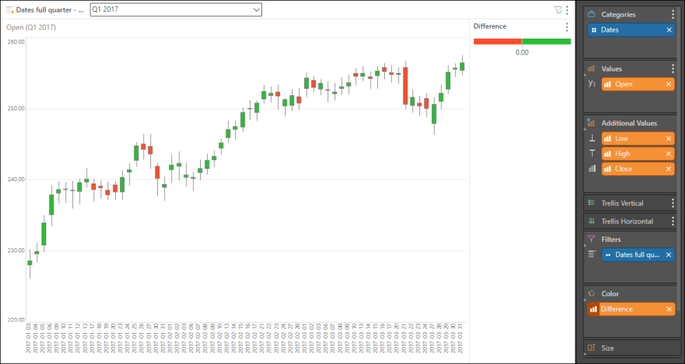
Candlestick Chart
This chart is essentially a candlestick chart. Candlestick charts are traditionally used in finance data to visualize the difference in a value (usually price) over time - for instance, the fluctuations in price over the course of a day, during a given month. The price fluctuations are represented by the open value (the price at the start of the day's trade) and close value (the price at the end of the day). Fluctuations outside of these two values are represented by lines (the wick) on either end of the box, plotting the highest and lowest values.
Build a Candlestick Chart
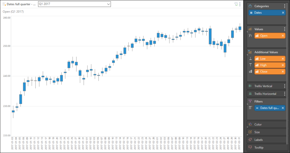
The candlestick chart requires the following four values: Open, Close, High, and Low. To build a candlestick chart, you must have measures that represent these four values. This example was created by downloading the stocks data Python packages in Model.
Step 1
Add the Open measure to the values zone, the under Additional Values add Close, High, and Low. Add the required time dimension to the Categories zone.
Step 2
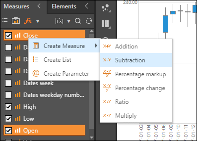
In this example, the chart was color coded to display green for a positive difference, and red for a negative difference. To add this calculation, Ctrl + select the Close and Open measures from the Measures panel, and right click. Under Create Measure select Constructed Functions, and then select Subtraction, to subtract the Open from the Close.
Step 3
Save the custom measure and add it to the Color zone, under Positive Negative. Boxes with an open value that is higher than the previous close value will be displayed in green. If the open value is lower than the previous close value, the box is displayed in red.